
Table of contents
Standard WordPress pages often struggle to convert visitors because they are cluttered with navigation menus, sidebars, and footer links. These elements act as exit ramps, allowing potential customers to wander away from your offer before they ever reach the checkout process. To maximize your results, you must create a dedicated, distraction-free environment that keeps the visitor focused entirely on your primary goal. By stripping away these secondary distractions, you ensure that every pixel on the screen serves a specific purpose in guiding the user toward a purchase.
Building these pages does not require advanced coding skills or a massive budget. With the right tools, you can transform your WordPress site into a powerful engine for lead generation and sales. The process involves selecting a professional template, crafting persuasive copy that highlights real-world outcomes, and integrating social proof to build necessary trust. Once your content is aligned, you must verify the technical path to purchase, ensuring that every button and checkout link functions flawlessly. This guide walks you through the entire workflow, from initial setup to final publication, providing the technical steps needed to launch a page that effectively captures interest and converts visitors into paying customers. By following this structured approach, you can create a professional-grade sales experience that stands out in a crowded market.
Why Dedicated Sales Pages Outperform Standard Pages
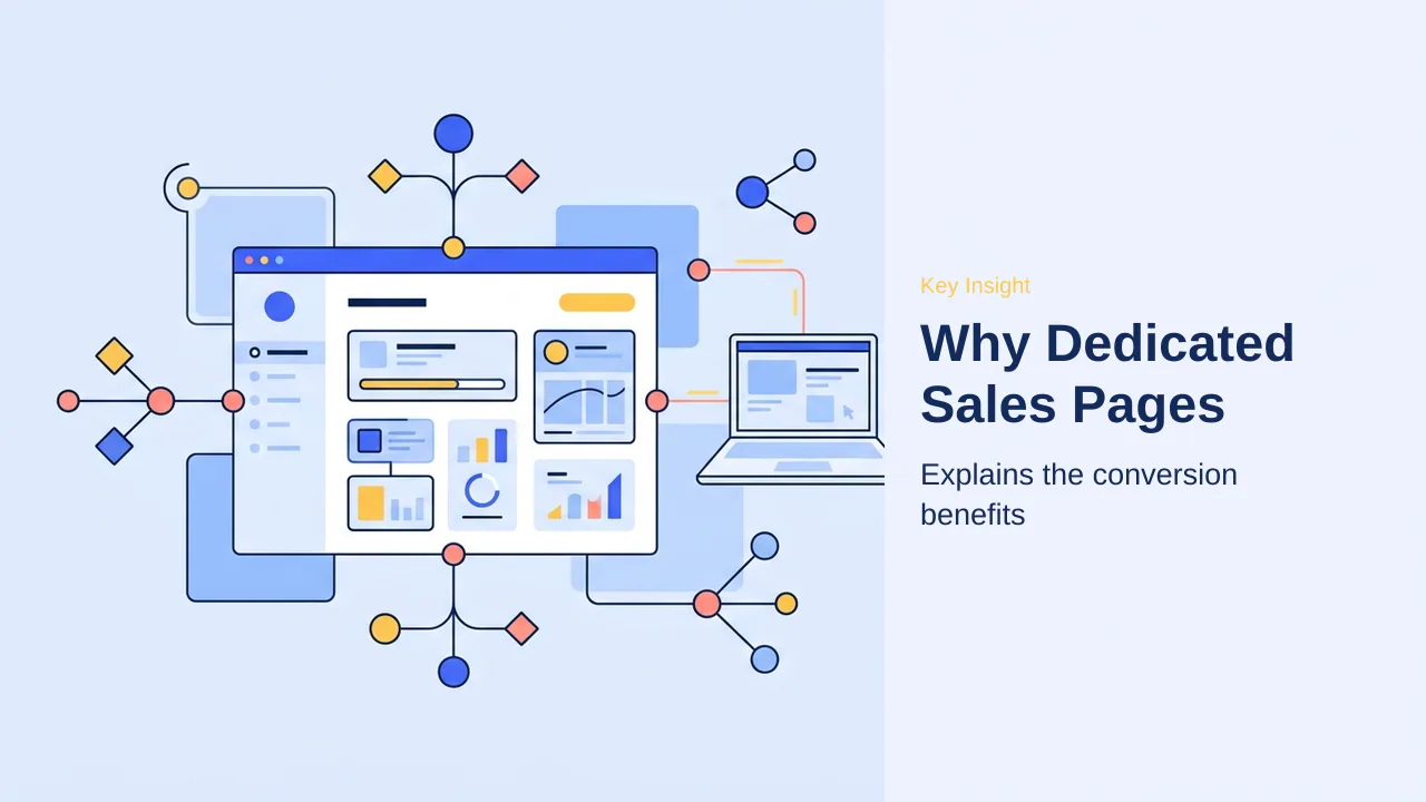
Standard WordPress pages are designed for browsing, which often works against business goals. Between header menus, sidebars, and footer links, these pages offer multiple exits before a visitor sees the primary call to action. A dedicated sales page is built to guide visitors toward a single, clear choice: to buy.
Removing everyday distractions creates a focused environment where visitor attention remains entirely on the offer. This strategic shift is essential for maximizing conversion rates. Removing navigation and sidebars prevents users from wandering off mid-decision, keeping them engaged until they reach the final purchase point.
Focusing on one offer at a time is a proven method to improve conversion rates. When you stop trying to cram multiple products or competing links onto a single page, you tell one clear story that asks for exactly one thing. This clarity reduces friction and helps hesitant visitors feel more confident in their decision to purchase.
The positioning is clearer when viewing a sales page as a specialized tool rather than a standard content page. While a blog post or an ‘About’ page serves to inform or build rapport, a sales page exists solely to convert. By isolating the visitor from the rest of the site’s navigation, the path to purchase becomes the only logical next step.
For those building a business, the decision to use a dedicated page is often the difference between a high bounce rate and a steady stream of new customers. Focusing on one offer is the most effective way to ensure product development translates into revenue.
Beyond the immediate conversion benefits, dedicated sales pages provide a clean canvas for iterative testing. By isolating the offer from the rest of the site, you can run A/B tests on headlines, button colors, or layout structures without impacting the user experience of your blog or informational pages. This data-driven approach allows for precise adjustments that compound over time, turning a static page into a dynamic revenue engine.
Furthermore, these pages act as a controlled environment for paid traffic. When you direct visitors from social media or search ads to a page stripped of navigation, you ensure that your advertising budget is spent on a destination designed for action rather than exploration. This alignment between ad intent and page structure is a critical factor in maintaining a lower cost-per-acquisition and higher overall return on investment.
The Anatomy of a High-Converting Sales Page
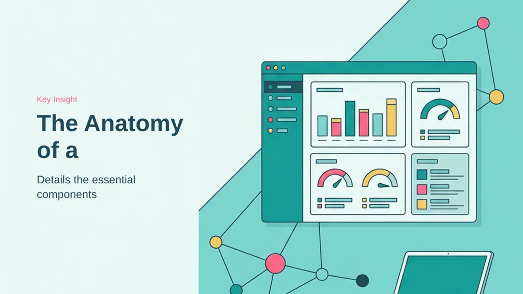
A successful sales page functions as a focused environment where every element serves a single purpose: guiding the visitor toward a purchase. By stripping away standard navigation and sidebars, you create a dedicated space where the offer remains the center of attention. Clear, result-oriented messaging is the foundation of this structure, ensuring visitors immediately understand the value provided.
Crafting Headlines and Value Propositions
The headline acts as the primary hook for your audience. To be effective, it must communicate specific results rather than vague promises. For instance, a headline stating “Double Your Freelance Rates in Next 60 Days” provides a concrete outcome that resonates with the target reader. Following the headline, a strong value proposition must clarify who the offer is for and why it matters, avoiding clever or ambiguous language that might cause a visitor to leave.
Leveraging Social Proof and Testimonials
Even the most persuasive copy often requires external validation to overcome visitor hesitation. Genuine social proof serves as the bridge between interest and action. By incorporating specific, result-driven testimonials, you demonstrate that others have already achieved success using your product. Star ratings and client logos further reinforce this credibility, providing the necessary reassurance for first-time buyers to proceed with confidence.
Effective social proof should always highlight tangible benefits rather than generic praise. When a customer shares a specific experience, such as recovering the cost of a course within a week, it carries significantly more weight than a simple endorsement. Integrating these elements strategically throughout the page helps address potential doubts before they become barriers to conversion.
Beyond the initial structure, consistency in branding across your sales page reinforces the professional image established by your headline and value proposition. Using a cohesive color palette and consistent font styles ensures that the page feels like a natural extension of your brand, which helps maintain visitor focus on the offer. Visual hierarchy also plays a significant role; by using larger, bolder text for primary benefits and smaller, lighter text for supporting details, you guide the reader’s eye naturally through the page content.
Furthermore, mobile responsiveness is non-negotiable for modern sales pages. Since a significant portion of traffic often originates from mobile devices, ensuring that your layout, images, and call-to-action buttons adjust gracefully to smaller screens is essential for preventing high bounce rates. A page that is difficult to navigate or read on a phone will likely result in lost conversions, regardless of how compelling the copy may be.
- Maintain consistent brand colors and typography throughout the page.
- Use visual hierarchy to guide the reader through key benefits.
- Verify that all elements, especially buttons, are easily tappable on mobile devices.
- Keep the path to purchase simple and free of unnecessary navigation.
Installing and Configuring SeedProd
To build high-converting sales pages without writing code, SeedProd serves as the primary tool for creating distraction-free environments. The plugin provides a beginner-friendly, drag-and-drop editor that simplifies the design process while offering a library of templates tailored for sales.
While a free version exists for basic layout testing, the premium version is necessary to access advanced conversion blocks. These features are essential for turning casual visitors into customers through specific design elements that standard WordPress pages lack.
The premium version unlocks several critical features for your sales funnel:
- Dynamic countdown timers to create urgency for limited-time offers.
- Pricing tables to clearly display product tiers and value.
- Testimonial blocks for building social proof and trust.
- WooCommerce-specific blocks for direct, streamlined checkout experiences.
- Email opt-in forms to capture leads who are not yet ready to purchase.
After purchasing the premium plan from the official website, install and activate the plugin on your WordPress site. Upon activation, navigate to SeedProd » Settings to input your license key. Clicking the Verify Key button unlocks the full suite of templates and conversion-focused blocks. You can locate your license key within your account dashboard or your automated purchase confirmation email.
Once the license is verified, you are ready to begin building. The plugin integrates directly into your existing WordPress dashboard, meaning you do not need to install separate software or manage external hosting for your landing pages. This seamless integration ensures that your sales pages remain part of your existing site infrastructure, allowing you to use your current payment gateways and email marketing services without complex technical workarounds.
Beyond the core installation, consider the long-term maintenance of your landing page library. As you scale, maintaining a consistent naming convention—such as including the date or campaign name—prevents dashboard clutter and simplifies future updates. This organizational discipline ensures that as your site grows, you can quickly locate and iterate on specific high-performing pages without confusion.
Furthermore, the premium version of SeedProd provides access to dynamic product grids and email opt-in forms, which are critical for building an ongoing relationship with your audience. By integrating these blocks, you can capture leads who are not yet ready to purchase, allowing for follow-up marketing that keeps your brand top-of-mind. These tools transform your sales page from a static destination into a functional component of your broader sales funnel.
Finally, remember that the initial setup is only the beginning. By creating two versions of a page with slightly different headlines or call-to-action placement, you can gather data on what resonates most with your audience. This iterative testing process is the most reliable way to improve page performance over time, ensuring that your investment in premium features yields measurable results in conversion rates and customer engagement.
Beyond initial setup, consider the long-term maintenance of your landing page library. As you scale, maintaining a consistent naming convention—such as including the date or campaign name—prevents dashboard clutter and simplifies future updates. This organizational discipline ensures that as your site grows, you can quickly locate and iterate on specific high-performing pages without confusion.
Beyond the initial setup, consider the long-term maintenance of your landing page library. As you scale, maintaining a consistent naming convention—such as including the date or campaign name—prevents dashboard clutter and simplifies future updates. This organizational discipline ensures that as your site grows, you can quickly locate and iterate on specific high-performing pages without confusion.
Creating and Templating Your Sales Page
With the plugin activated, open the SeedProd dashboard. From the WordPress dashboard, navigate to SeedProd » Landing Pages. To create a new page, click the + Add New Landing Page button. SeedProd prompts for a Page Name and URL confirmation. A clear internal name, such as “Spring Course Sales Page,” simplifies future management. The URL field populates automatically; edit this slug to ensure it remains clean and descriptive. Click Next: Choose Template to proceed.
Selecting the Right Sales Template
SeedProd provides a library of templates to serve as complete starting points. Use the category filters to isolate options; selecting the Sales category displays layouts specifically designed for product or service conversion. These templates include pre-built headline areas, benefit sections, testimonial spots, and call-to-action buttons. To select a design, hover over the thumbnail and click the checkmark icon to load it into the editor. Starting with a pre-made design saves significant time for initial builds.
Customizing Page URLs and Internal Names
Proper organization is essential when managing multiple offers. Review the URL slug before finalizing to ensure it aligns with marketing campaigns and remains unique. Consistent internal naming conventions prevent dashboard clutter as the library of landing pages grows. When duplicating high-performing pages for new launches, verify that the URL slug remains unique to avoid content conflicts.
Note: Always use descriptive internal names for your pages to keep your dashboard organized as your business grows.
Beyond initial setup, consider the long-term maintenance of your landing page library. As marketing efforts expand, managing multiple variations of the same offer requires a structured approach. For those aiming to refine their approach, iterative testing is a powerful strategy. By creating two versions of a page with slightly different headlines or call-to-action placement, you can gather data on what resonates most with your audience. This data-driven approach allows for optimization of conversion rates over time.
- Use consistent naming conventions for easy identification.
- Verify unique URL slugs when duplicating pages.
- Implement iterative testing to refine page performance.
- Monitor analytics to identify high-converting elements.
- Use consistent naming conventions for easy identification.
- Verify unique URL slugs when duplicating pages.
- Implement iterative testing to refine page performance.
- Monitor analytics to identify high-converting elements.
Designing Content and Persuasive Copy
With your headline established, the focus shifts to building out the page body using clear, persuasive text and supporting visuals. This phase is where you transform a curious visitor into a confident buyer by clearly articulating the value of your offer. To add any element, locate the desired block in the left-hand panel—such as an Image or Text block—and drag it directly onto your live preview. Clicking any block in the preview opens its specific settings in the sidebar, allowing for precise adjustments to font, color, and layout.
Key considerations for Designing Content and Persuasive Copy
When drafting your sales copy, focus on real-world outcomes rather than listing technical features. For instance, instead of highlighting that a plugin includes “automated database backups,” describe how it “protects your hard work automatically so you never lose your website data if your server crashes.” This shift ensures the visitor understands the tangible benefit to their daily workflow or business goals. Keep text punchy and direct to maintain momentum; avoid long, dense paragraphs that might cause a reader to lose interest before reaching your call to action.
Visuals play a critical role in maintaining engagement. Use images to break up long text, as a wall of words often feels overwhelming to a visitor. Aim to provide a relevant image or a short, impactful line of text for every key claim you make. This visual rhythm keeps the reader scrolling down the page, ensuring they consume the entire narrative you have crafted.
Practical checks for Designing Content and Persuasive Copy
Before finalizing your design, perform a quick audit of your content flow. Ensure that each section builds logically toward your primary goal. Verify that every claim is supported by either a benefit-driven explanation or a visual element that clarifies the value proposition. If a section feels cluttered or does not directly contribute to the visitor’s decision to purchase, consider removing it to maintain a distraction-free environment.
Finally, check that your layout remains consistent across different screen sizes. Since many users will view your page on mobile devices, ensure your text and images render clearly on smaller screens. A well-designed page should guide the visitor’s eye naturally from the headline down to the final call to action, regardless of the device they are using.
Beyond the initial layout, consider the psychological impact of your design choices. Visual hierarchy guides reader attention, ensuring that the most critical information—such as your primary value proposition or a compelling testimonial—stands out immediately. Use contrasting colors for your call-to-action buttons to make them pop against the background, as this simple adjustment often increases click-through rates by drawing the eye toward the desired action.
Consistency in branding reinforces professional image, which is vital for building trust with new visitors. Ensure that your color palette, typography, and image style remain uniform throughout the page. A disjointed design can signal a lack of attention to detail, potentially causing visitors to question the quality of the product itself. When you maintain a cohesive look, the entire page feels like a natural extension of your brand, creating a sense of reliability that encourages users to complete their purchase.
Finally, remember that mobile responsiveness is essential for preventing high bounce rates. Since many users will view your page on smartphones, verify that your layout, images, and buttons adjust gracefully to smaller screens. If elements appear cramped or difficult to tap, visitors are likely to leave before engaging with your content. A well-optimized mobile experience ensures that your message remains clear and accessible, regardless of the device your potential customer is using.
Building Credibility with Social Proof
Even the most persuasive copy often fails to convert if visitors remain skeptical about your claims. By integrating social proof elements directly into your layout, you bridge the gap between interest and action. These markers serve as external validation, signaling that your offer is both legitimate and effective.
Adding Testimonials and Ratings
To effectively build trust, drag the Testimonials block from the SeedProd panel onto your page. When selecting content, prioritize specific, result-driven quotes over generic praise. A testimonial detailing a concrete outcome—such as revenue growth or time saved—carries significantly more weight than a simple compliment. Supplement these with Star Rating blocks or client logo grids to visually reinforce your authority.
- Use high-quality headshots to humanize testimonials.
- Include the customer’s name and role for added authenticity.
- Place star ratings near your pricing or call-to-action buttons.
- Highlight specific metrics or milestones achieved by past clients.
- Rotate testimonials to keep the page content fresh for repeat visitors.
Using Urgency Responsibly
Adding a Countdown Timer block can effectively nudge hesitant visitors toward a decision, provided the pressure is genuine. Only use countdown timers for real deadlines, such as the end of a limited-time sale or an enrollment window. When visitors realize a timer is artificial, it can damage your brand’s credibility and undermine the trust you have worked to establish.
Note: Always ensure your social proof elements are mobile-responsive, as many visitors will view these credibility markers on smaller screens where layout shifts can easily occur.
Beyond standard testimonials, consider incorporating trust badges or security seals near your payment forms. These small visual cues reassure visitors that their sensitive data is handled with care. When selecting these elements, ensure they are recognizable and relevant to your industry, such as verified payment processor logos or industry-specific certifications.
Another effective strategy involves client logo grids. Displaying the logos of companies or individuals who have utilized your services provides immediate, non-intrusive validation. This approach works particularly well for B2B services where professional reputation is a primary driver of conversion. Keep these grids clean and uniform in size to maintain a professional aesthetic that doesn’t distract from your core message.
- Use recognizable security badges to reduce checkout anxiety.
- Keep client logo grids monochrome for a cohesive, professional look.
- Ensure all trust elements are properly spaced to avoid visual clutter.
- Verify that badge images are high-resolution to prevent pixelation on high-density displays.
- Place trust markers strategically near your primary call-to-action buttons.
- Use recognizable security badges to reduce checkout anxiety.
- Keep client logo grids monochrome for a cohesive, professional look.
- Ensure all trust elements are properly spaced to avoid visual clutter.
- Verify that badge images are high-resolution to prevent pixelation on high-density displays.
- Place trust markers strategically near your primary call-to-action buttons.
Connecting Checkout and Calls to Action
A high-converting sales page relies on a frictionless path to purchase. Once your copy and social proof are established, the final step is ensuring your call-to-action (CTA) buttons function perfectly and lead visitors directly to your payment gateway. The goal is to minimize the number of clicks required to complete a transaction, as every additional step introduces a potential point of abandonment where a customer might reconsider their decision.
Most templates include a button by default, but you can easily add more by dragging the Button block onto your live preview. Use direct, action-focused text like “Enroll Now” or “Get Instant Access” to make the next step obvious. In the link field, paste the direct address to your product page or checkout form. If you use WooCommerce, you can point your button directly to your product page. However, SeedProd also offers dedicated WooCommerce blocks, like the Checkout block, allowing customers to submit their payment directly on your sales page without ever visiting your standard cart. This direct checkout approach is highly effective for reducing abandonment, as it keeps the user within the focused environment you have carefully constructed.
For digital products or single items, you can link your button directly to a quick payment form. If you haven’t set up payment processing yet, research the best Stripe payment plugins to choose the right solution for your specific business needs. Whichever route you choose, please test the button yourself after the page is live. Taking a few seconds to click through your buttons ensures your links work properly and prevents lost sales.
- Always test your call-to-action button after publishing your page.
- Use WooCommerce blocks to allow direct checkout on the sales page.
- Verify that your payment gateway is active before sending traffic.
- Run a live test purchase to ensure the transaction flow is complete.
- Ensure your payment gateway is configured correctly to handle real transactions.
- Check that your button links are updated if you change your product URL.
No matter what route you choose, always test your call-to-action button after publishing your page. Taking a few seconds to click through ensures your link works properly and prevents lost sales. If you are selling a service or a course, consider how the checkout flow integrates with your existing user account system. A seamless transition from the sales page to the payment confirmation page is essential for maintaining the trust you have built through your copy and social proof. By verifying every link, you ensure that the final step of the customer journey is as smooth as the first.
Beyond basic button placement, consider the psychological impact of your checkout flow. A seamless transition from the sales page to the payment confirmation page is essential for maintaining the trust you have built through your copy and social proof. By verifying every link, you ensure that the final step of the customer journey is as smooth as the first. If you are selling a service or a course, consider how the checkout flow integrates with your existing user account system. A smooth handoff between your sales page and the final payment gateway prevents technical friction that often leads to abandoned carts.
Before you finalize your page, verify that your payment gateway is active and configured correctly to handle real transactions. Running a live test purchase is the only way to confirm the transaction flow is complete and that your customers will receive their products or access to your services without delay. If you change your product URL or update your pricing structure, always check that your button links are updated accordingly to avoid dead ends.
Beyond the technical setup, consider the user experience during the final payment phase. A seamless transition from your sales copy to the payment gateway is critical for maintaining the momentum built during the visitor’s journey. By utilizing WooCommerce blocks, you can keep the customer within your branded environment, which often reduces the anxiety associated with being redirected to a generic cart page.
Always verify that your payment gateway is fully active and configured to handle live transactions before directing traffic to your page. A common oversight is leaving a gateway in ‘test mode,’ which prevents real payments from processing. Running a live test purchase is the only way to confirm the transaction flow is complete and that your customers will receive their products or access to your services without delay.
If you update your product pricing or change your URL structure, remember to audit your button links. A broken link at the final stage is a primary cause of lost revenue. Regularly checking these paths ensures your sales funnel remains functional and reliable.
Beyond the technical configuration of your payment gateway, consider the psychological impact of your checkout flow. A seamless transition from your sales copy to the payment gateway is critical for maintaining the momentum built during the visitor’s journey. By utilizing WooCommerce blocks, you can keep the customer within your branded environment, which often reduces the anxiety associated with being redirected to a generic cart page.
- Verify that your payment gateway is active before sending traffic.
- Run a live test purchase to ensure the transaction flow is complete.
- Check that your button links are updated if you change your product URL.
Finalizing Settings and Publishing
Before your page goes live, you must ensure it functions correctly within your existing site environment. Proper configuration prevents common display issues and ensures your marketing efforts reach the right audience.
Configuring SEO and Isolation Mode
Navigate to the Page Settings tab to manage your page’s metadata. Setting a clear title and description here helps search engines index your content effectively. If you notice your page appears misaligned or inherits unwanted styling from your active theme, enable Isolation Mode. This setting instructs the builder to ignore theme-specific CSS, ensuring your design remains distraction-free and consistent with your original layout.
Additionally, connect your email marketing service via the Connect tab to capture leads directly from your page. This integration is essential for nurturing visitors who are not yet ready to purchase.
Mobile Preview and Troubleshooting Cache
Always verify your design using the mobile preview tool before clicking publish. A layout that looks perfect on a desktop may require adjustments for smaller screens to ensure buttons and text remain accessible. Once satisfied, click the dropdown arrow next to the Save button and select Publish to make the page live.
If your page does not appear immediately after publishing, a caching plugin is likely serving an older version of your site. Clear your site’s cache to force the server to display the updated content. If you continue to experience issues, verify that the page status is set to Published rather than Draft in your dashboard settings.
Beyond basic configuration, verify that your page URL structure remains consistent with your site’s permalink settings to avoid broken links. If you are running multiple campaigns, consider using distinct internal names for each page to simplify tracking in your dashboard. Once the page is live, monitor your site’s analytics to identify where visitors might be dropping off, as this data often reveals opportunities to refine your copy or adjust your call-to-action placement.
For those managing high-traffic launches, ensure your hosting environment is optimized to handle the influx of visitors. If your page includes dynamic elements like countdown timers or live social proof feeds, these require consistent server resources to load correctly. Testing your page on various mobile browsers is also recommended, as different rendering engines can occasionally affect the alignment of complex layouts despite the protection provided by Isolation Mode.
Finally, remember that a published page is not a static asset. Periodically review your conversion rates and perform A/B testing on your headlines or button text to see what resonates best with your audience. Small, data-driven adjustments often yield significant improvements in overall performance, allowing you to maximize the return on your marketing efforts over time.
Beyond the technical setup, consider the psychological impact of your page’s URL structure. Using a clean, descriptive slug that mirrors your campaign name reinforces visitor confidence and simplifies internal tracking within your dashboard. If you are managing multiple seasonal promotions, distinct internal naming conventions prevent confusion and ensure that your analytics data remains segmented correctly for future performance reviews.
For high-traffic launches, ensure your hosting environment is adequately provisioned to handle concurrent visitors. Pages featuring dynamic elements, such as live countdown timers or social proof feeds, require consistent server resources to render correctly. If your page layout appears complex, testing it across multiple mobile browsers is recommended, as variations in rendering engines can occasionally influence alignment despite the protective benefits of Isolation Mode.
Finally, treat your published page as a dynamic asset rather than a static document. Regularly monitor conversion metrics to identify where visitors might be exiting the funnel, as this data often highlights opportunities to refine your copy or adjust the placement of your primary call-to-action. Implementing small, data-driven adjustments—such as testing different headline variations or button colors—often yields significant improvements in overall performance. This iterative approach allows you to maximize the return on your marketing efforts and ensures your sales page remains a reliable engine for growth over time.
Creating a high-converting sales page is ultimately an exercise in focus. By removing the standard navigation elements of your WordPress site, you eliminate the friction that often leads to abandoned carts and lost opportunities. The goal is to guide your visitor through a logical journey: capturing their attention with a strong headline, building desire through clear benefits, establishing trust with social proof, and finally, providing a frictionless path to purchase. Every element on the page should exist to support this single objective, ensuring that the visitor never feels overwhelmed or distracted by secondary content.
The technical implementation using tools like SeedProd simplifies this process significantly, allowing you to move from a blank screen to a fully functional landing page without touching a line of code. However, the technology is only as effective as the strategy behind it. Always prioritize real-world outcomes over technical features, and ensure that your social proof feels authentic and relevant to your audience. When you use urgency, such as countdown timers, do so with integrity to maintain the trust you have worked hard to build. A single broken link or a misaligned layout can undo hours of careful design, which is why testing your checkout flow and verifying mobile responsiveness are non-negotiable steps in the launch process.
As you refine your approach, remember that conversion optimization is an iterative practice. Monitor how your audience interacts with your page, and do not hesitate to adjust your copy or layout based on the results you observe. By maintaining a clean, distraction-free environment and keeping the user experience at the center of your design, you create a sustainable foundation for your business growth. Whether you are launching a new course, a digital product, or a service, a well-crafted sales page serves as your most effective salesperson, working around the clock to turn casual visitors into loyal customers. With the steps outlined here, you are well-equipped to build pages that not only look professional but also deliver measurable results for your brand.